Dscover
Menu
Say
Hi
Services
Portfolio
About
News & Views
Contact
back
Growth marketing
Digital Strategy
SEO
PPC
Social Media
Content Marketing
All Services
PORTFOLIO
George Smith
View Project
PORTFOLIO
Kisawa Sanctuary
View Project
News & Views
All
60
Announcements
3
Industry insights
53
Clients
2
22 March 2023
Crafting the Golden Touch for Luxury Jewellery Brands
Read more
28 June 2023
5* Favourites – Luxury Jewellers on Instagram
Read more
19 June 2023
The Luxury Goods Market | Trend Analysis 2023
Read more
9 June 2023
TikTok vs Instagram Influencers – Which is better for Luxury Brands?
Read more
30 May 2023
AI Image Generation and How We Can Use It
Read more
18 October 2022
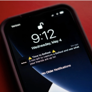
BeReal as a Marketing Tool: Bad for Brands or The Best Yet?
Read more
5 September 2022
The Ins and Outs of Instagram Subscriptions
Read more
16 August 2022
Getting to Know GA4: Google Analytic’s Next Generation
Read more
8 August 2022
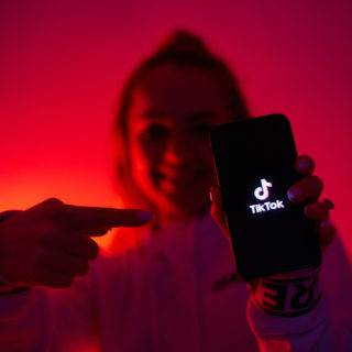
Why TikTok Should Be at the Top of Your Social Strategy
Read more
Load more
{"post_type":"post","posts_per_page":9,"paged":1,"order":"DESC","error":"","m":"","p":0,"post_parent":"","subpost":"","subpost_id":"","attachment":"","attachment_id":0,"name":"","pagename":"","page_id":0,"second":"","minute":"","hour":"","day":0,"monthnum":0,"year":0,"w":0,"category_name":"","tag":"","cat":"","tag_id":"","author":"","author_name":"","feed":"","tb":"","meta_key":"","meta_value":"","preview":"","s":"","sentence":"","title":"","fields":"","menu_order":"","embed":"","category__in":[],"category__not_in":[],"category__and":[],"post__in":[],"post__not_in":[],"post_name__in":[],"tag__in":[],"tag__not_in":[],"tag__and":[],"tag_slug__in":[],"tag_slug__and":[],"post_parent__in":[],"post_parent__not_in":[],"author__in":[],"author__not_in":[],"search_columns":[],"ignore_sticky_posts":false,"suppress_filters":false,"cache_results":true,"update_post_term_cache":true,"update_menu_item_cache":false,"lazy_load_term_meta":true,"update_post_meta_cache":true,"nopaging":false,"comments_per_page":"50","no_found_rows":false}
Portfolio